ShopDreamUp AI ArtDreamUp
Deviation Actions
Entry level + Early access
Entry level get access to my whole backlog
of illustrations. + Early access to new ones.
$5/month


Suggested Deviants


Suggested Collections


You Might Like…


Featured in Groups


Description
<div align="center">

 Commission Information
*
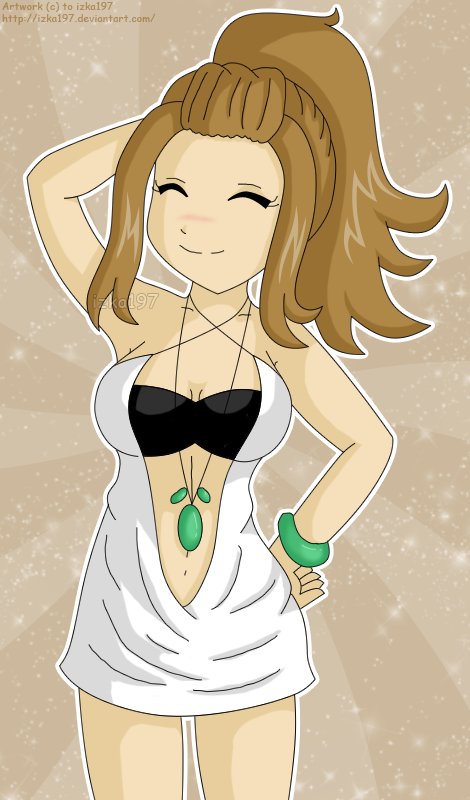
This is a prize for =AishuuLovesSweets for winning 2nd place in #CoolGirls's OC Fashion Contest- it's her OC Ai (Wink)") Hope you likey
Hope you likey  (Smile)")
ps. sorry for the bad anatomy T-T Her head seemed too big but when I made it tiny bit smaller it looked too small T-T I guess it's because of the hair style. I thought I did ok with it aww
*
Ai, clothing design © to =AishuuLovesSweets
Art © to izka197 (me)
sparkle brush © not me
*
This is a prize for =AishuuLovesSweets for winning 2nd place in #CoolGirls's OC Fashion Contest- it's her OC Ai
ps. sorry for the bad anatomy T-T Her head seemed too big but when I made it tiny bit smaller it looked too small T-T I guess it's because of the hair style. I thought I did ok with it aww
*
Ai, clothing design © to =AishuuLovesSweets
Art © to izka197 (me)
sparkle brush © not me
Image size
470x800px 240.78 KB
© 2010 - 2024 izka197
Comments30
Join the community to add your comment. Already a deviant? Log In
Critique! ")
Well first of all, I want to say that the anatomy is very good - proportions and lengths are fairly accurate, especially the width of her hips and shoulders, and the length of her waist. The arms are at an accurate length as well. The hands seem a bit small on her though - I would try and make the fingers a bit longer next time (even curled up, they still look a little short.) The breasts are good too - maybe a tad large, but otherwise they are drawn very well. And her right forearm (her right, my left - the one raised) looks a bit too curved - even when trying to get a fluid look, it should be a little bit straighter.
Now onto the clothes - I must say, you are good at coming up with different fashion designs! I like the different outfits you give your characters - that's one thing I myself still need to work on. Now her dress here seems a little flat on her skin - you may have been trying to get that look, but with the wrinkles on the bottom, it sort of throws it off. I would suggest drawing the edges of her clothing a bit further from her skin next time to give them a bit of volume. As for the wrinkles themselves, try using different lines rather than simple straight lines - a "hook" line, or a v-shaped line is good to use. In fact, you might even want to try just pure shading to get a wrinkled look instead of a black line - it looks much better when it's done right, and it helps clothes to "flow" much better.
The thing I would focus on improving would be her head - you have a good start on heads, but they need to be taken a step further - her chin looks a little too centered - if you were to move it to the left more, it would make her head seem less flat, and more in-place with her neck.
Now the eyes aren't in this drawing, so I'll use another drawing as a reference (howzabout that awesome Athena drawing you gave me? ) Well first of all, I would make the eyelashes a bit thicker so they appear to be more a part of the top of the eye - right now it's just a thin line, but if it were thicker at the base, it would probably look a lot better. Also, try not to completely outline the eye in black - if you taper off the side lines around the bottom of the eye (hopefully that made sense), it helps to set the eye into the head more.
Try using a bit more shading on the nose to make it look bigger - the line art is actually okay as it is, but shading makes a huge difference.
Now for the hair (I'm afraid I'm turning into the Nazi I become when I'm placed in charge of something...). Like the face, the hair is getting there, but needs to be taken a step further. Right now, the ends are all about the same size, shape, and position - when you're doing hair, you need to have variety - you're trying to make a solid mass look like it's made of lots of small strands. The best way to do this is to have lots of shading in the hair - line-like shading that makes the hair more three-dimensional. You have that started with the highlights, but take it a step further with the shadows - they're there, but what about the middle of the hair? Try adding shadow lines in the middle of the hair and see what happens. It should improve the look of the hair. Keep practicing, and eventually the hair will look more and more realistic.
So the last thing I want to talk about goes for all your drawings in general. Actually two things. I think so.
You really should try different thicknesses in your lines. It drastically improves the look of the piece - much more than you might think. Lines should be thicker where there's more mass - the tip of tip of the nose, ends of hair, fingertips, joints, etc.
And last but not least (no really, this is it - I mean it this time) Don't be afraid to draw different things! Many of your characters (actually mostly all of your characters) are front-facing, eye-level, with just different poses for the arms and legs. Part of being an artist is being able to draw things in different points of view. Try drawing in perspective - any perspective, really. It takes a bit of practice, but getting it to work means all the more skill you have. You might also want to consider drawing guys?
You're doing really good, Izka You're on your way to being something great. It just takes time and patience, and working on the little things, that makes a person good. I'm working on it too - everyone is, so keep on doing what you do, and with time you will get to be what you want to be.
Well first of all, I want to say that the anatomy is very good - proportions and lengths are fairly accurate, especially the width of her hips and shoulders, and the length of her waist. The arms are at an accurate length as well. The hands seem a bit small on her though - I would try and make the fingers a bit longer next time (even curled up, they still look a little short.) The breasts are good too - maybe a tad large, but otherwise they are drawn very well. And her right forearm (her right, my left - the one raised) looks a bit too curved - even when trying to get a fluid look, it should be a little bit straighter.
Now onto the clothes - I must say, you are good at coming up with different fashion designs! I like the different outfits you give your characters - that's one thing I myself still need to work on. Now her dress here seems a little flat on her skin - you may have been trying to get that look, but with the wrinkles on the bottom, it sort of throws it off. I would suggest drawing the edges of her clothing a bit further from her skin next time to give them a bit of volume. As for the wrinkles themselves, try using different lines rather than simple straight lines - a "hook" line, or a v-shaped line is good to use. In fact, you might even want to try just pure shading to get a wrinkled look instead of a black line - it looks much better when it's done right, and it helps clothes to "flow" much better.
The thing I would focus on improving would be her head - you have a good start on heads, but they need to be taken a step further - her chin looks a little too centered - if you were to move it to the left more, it would make her head seem less flat, and more in-place with her neck.
Now the eyes aren't in this drawing, so I'll use another drawing as a reference (howzabout that awesome Athena drawing you gave me?
Try using a bit more shading on the nose to make it look bigger - the line art is actually okay as it is, but shading makes a huge difference.
Now for the hair (I'm afraid I'm turning into the Nazi I become when I'm placed in charge of something...). Like the face, the hair is getting there, but needs to be taken a step further. Right now, the ends are all about the same size, shape, and position - when you're doing hair, you need to have variety - you're trying to make a solid mass look like it's made of lots of small strands. The best way to do this is to have lots of shading in the hair - line-like shading that makes the hair more three-dimensional. You have that started with the highlights, but take it a step further with the shadows - they're there, but what about the middle of the hair? Try adding shadow lines in the middle of the hair and see what happens. It should improve the look of the hair. Keep practicing, and eventually the hair will look more and more realistic.
So the last thing I want to talk about goes for all your drawings in general. Actually two things. I think so.
You really should try different thicknesses in your lines. It drastically improves the look of the piece - much more than you might think. Lines should be thicker where there's more mass - the tip of tip of the nose, ends of hair, fingertips, joints, etc.
And last but not least (no really, this is it - I mean it this time) Don't be afraid to draw different things! Many of your characters (actually mostly all of your characters) are front-facing, eye-level, with just different poses for the arms and legs. Part of being an artist is being able to draw things in different points of view. Try drawing in perspective - any perspective, really. It takes a bit of practice, but getting it to work means all the more skill you have. You might also want to consider drawing guys?
You're doing really good, Izka